HVAC Logo Design: Ideas, Styles, and What to Skip
A good HVAC logo has one job: read clean on a truck going 40 and on a card in someone's hand. The snowflake, the swoosh, the gradient are all decoration that fights that job.
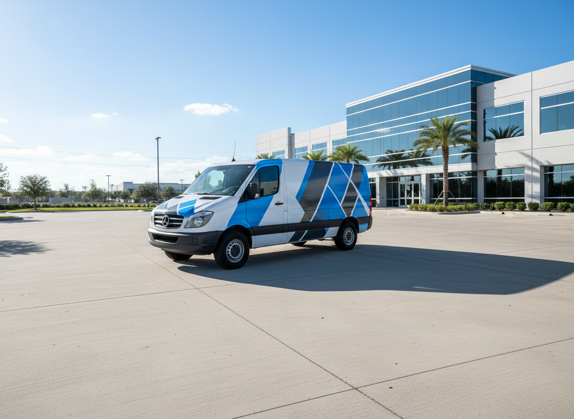
A good HVAC logo has exactly one job: read clean on a truck doing 40 down the highway and on a business card in someone's hand. That's it. The snowflake, the swoosh, the flame, the gradient are all decoration that fights that one job, and usually wins.
Twenty years of drawing these has taught me the same lesson over and over: the logos that work are simple, and the ones that don't are trying too hard. Here's what makes an HVAC logo work, the styles worth picking, and the clichés to leave in the reference folder.
What makes a good HVAC logo?
Three things:
- It's legible small and far. If it turns to mush on a card or a van door, it's not a logo, it's an illustration.
- It works in one color. You'll need it in solid black (invoices), solid white (dark shirts), and one flat color (etched, embroidered, vinyl-cut). If it only looks good as a full-color gradient, it'll fail half the places you need it.
- It doesn't look like the other twelve HVAC companies in town, which means skipping the stuff everyone uses.
What should an HVAC logo include?
Less than you think. A clean wordmark of your company name, set in a font with some backbone. Optionally one simple mark: a monogram, or a restrained symbol. Your name should be readable even if the symbol is gone, because on a shirt or a small sign it often will be.
You do not need to illustrate what HVAC is. Homeowners know what a heating and air company does. A literal furnace in the logo is like a bakery drawing a loaf of bread: technically on-topic, adds nothing.
Popular HVAC logo styles, and which to pick
- Wordmark (just the name, styled): the safest, most flexible choice. Scales anywhere, never dates badly. If you pick one thing, pick this.
- Wordmark plus a simple icon: a small monogram or abstract mark beside the name. Good if you want something to use alone on a hat or as a profile picture.
- Badge or emblem: the name wrapped in a circle or crest, often with "est. 2004." Looks solid and trustworthy; just make sure it still reads when it's shrunk, because badges die small.
- Mascot or illustrative: a character or detailed scene. Memorable when it's genuinely good, expensive to do well, and a liability when it's not. High risk.
For most shops: a wordmark, or a wordmark plus a simple mark. Boring on purpose. Boring scales.
Try us free
Want it designed right, without the guesswork?
HVAC logo clichés to avoid
You've seen every one of these:
- The snowflake next to a flame. The "we do both heating and cooling" cliché. Everyone has it; it's wallpaper now.
- The swoosh. The 1990s never left HVAC. A swoosh says "template."
- The house outline with a heart or a checkmark. Generic home-services filler.
- Gradients and drop shadows. They look fine on a screen and fall apart in embroidery, vinyl, and one-color print.
- Three shades of blue. Pick one blue. Or, braver, don't be blue at all.
None of these are wrong exactly. They're just used up. Using them makes you look like everyone else, which is the one thing a logo exists to prevent.
Modern HVAC logo trends worth stealing
- Bold, heavy wordmarks. Thick, confident letters read great on a van and feel established.
- One strong color, owned hard. Be the orange company in a sea of blue. Recognition you get for free.
- A simple geometric monogram (your initials in a clean shape) for the spots a full logo won't fit.
- Flat, single-weight design that survives being cut in vinyl or stitched on a hat without falling apart.
The theme: simpler, bolder, one color. Everything that makes a logo work at a distance.
How much should an HVAC logo cost?
All over the map. A free AI or logo-maker: $0, and you get a raster file with no vector and no rights. A freelancer on Fiverr: $50 to $300, quality is a coin flip. A solid independent designer or studio: $500 to $3,000 with real files and variations. A design subscription (like ours): it's just included with the rest of your brand work.
The number that actually matters isn't the price, it's whether you get vector files (AI, EPS, SVG) and full ownership. Without vector, your sign shop and embroiderer can't use it, and you'll pay to have it redrawn the first time you order a wrap. A "$25 logo" that has to be rebuilt for print wasn't cheap.
Get it drawn right the first time
A logo is the one asset everything else is built on. The wrap, the cards, the shirts, and the signs all inherit it. Draw it wrong and you pay for that mistake on every piece after.
We design HVAC logos and brand identities built to work everywhere they have to (one color, vector, print-ready), and then carry that logo across your whole HVAC brand. Your first design is free, so you can see it on a mock truck and card before you commit.
Keep it simple, make it one color, and make it yours. The snowflake will still be there for the next guy.
Keep reading
HVAC branding & design →