The Best Colors for HVAC Branding (and What They Signal)
Blue for cooling, red for heat, so every HVAC truck in your market looks the same. Here's what colors actually signal, and how picking one bold color gets you remembered.
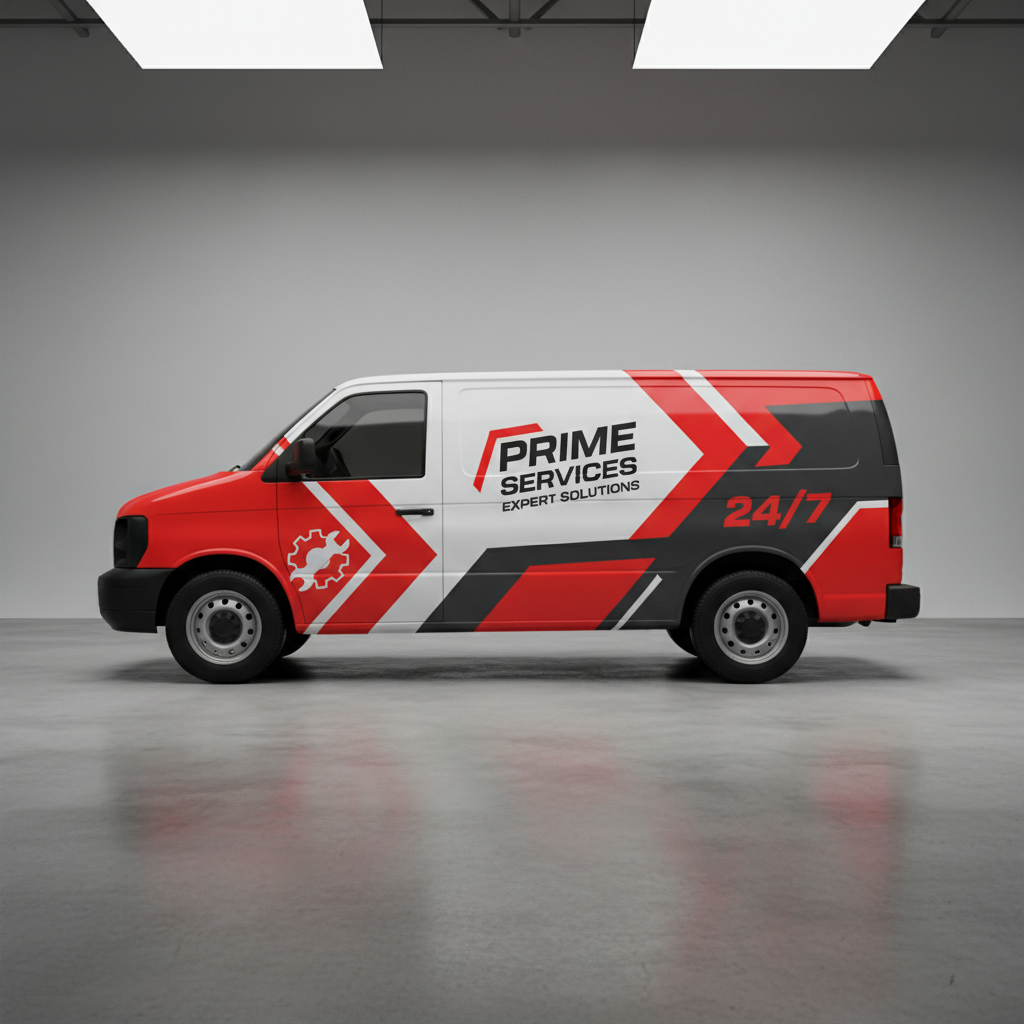
Blue for cold, red for hot. That's the entire color strategy of about 90% of HVAC companies, which is exactly why every truck in your market looks like every other truck in your market. When the whole field paints itself the same two colors, the fastest way to get noticed is to not.
Twenty years of putting HVAC brands on trucks and signs has made me a broken record about this: pick one strong color and own it. Here's what colors actually signal, which ones cause problems in print and vinyl, and how to stand out without looking like a clown.
Why is every HVAC company blue and red?
Because it's the obvious move. Blue reads as cool, clean, calm, and trustworthy; it's the safe default for cooling and for service businesses generally. Red reads as heat, urgency, and energy. Put them together and you've literally color-coded "heating and cooling."
It's not wrong. It's just unanimous. And a color choice everyone makes stops being a choice, it's camouflage. If a homeowner watched three HVAC vans drive by, all navy-and-red with a snowflake, they couldn't tell you one from another an hour later.
What do HVAC brand colors actually signal?
Color does real work before anyone reads a word:
- Blue: trust, cleanliness, calm. Safe, professional, everywhere.
- Red or orange: energy, urgency, heat. Great for standing out and for an "emergency service" feel; a lot of it can read as aggressive.
- Green: efficiency, comfort, eco. A good angle if you sell high-efficiency systems and heat pumps.
- Black or charcoal: premium, high-end. Pairs well with one bright accent for a modern, upscale look.
- Yellow or safety-orange: visibility and a blue-collar, hard-working feel. Loud, memorable, hard to miss on the road.
None is "correct." The point is to pick on purpose, for the position you want, instead of defaulting to blue because the last guy did.
How do you pick a color that stands out?
Simple rule: look at your market and zag. Drive around, look at the competition's trucks, and pick a lane nobody owns. If everyone's navy, be orange. If it's a sea of red, go clean black-and-white. You want to be the company people describe by color, "the green AC guys," "the orange truck." That nickname is free advertising, and it only happens when you're not the same color as the herd.
Then commit. One dominant brand color, maybe one accent, used everywhere: truck, shirts, cards, signs, yard signs. Consistency is what turns a color into recognition.
Try us free
Want it designed right, without the guesswork?
Which colors cause print and wrap problems?
This is the part nobody mentions until the proof looks wrong. Some colors are genuinely hard to reproduce:
- Bright greens and oranges can shift noticeably between your screen, CMYK print, and printed vinyl. What glows on the monitor can go muddy on the truck.
- Neons and fluorescents don't exist in standard CMYK at all; they need special (pricier) inks or they come out flat.
- Gradients that look slick on screen can band or blotch in large-format print, and they're a nightmare in embroidery and cut vinyl.
- Very light pastels disappear on a white van and wash out on signage.
The fix is easy if you plan for it: pick your colors as Pantone (PMS) values, not just a screen color, so they stay consistent from cards to wrap to shirts. A designer who works in print will spec this for you so the blue on your van matches the blue on your card.
How many colors should an HVAC brand use?
Two or three, tops. One dominant color, one accent, and a neutral (black, white, or gray). More than that and nothing stands out, print costs climb, and consistency gets impossible to hold across a crew.
Discipline reads as professional. A brand that uses two colors flawlessly looks more established than one splashing five.
Lock your colors into the whole brand
Colors only pay off when they're consistent everywhere: the exact same on the truck, the card, the shirt, and the sign. That takes locked-down values, not "close enough."
That consistency is the core of HVAC branding. We set your palette in proper print values and carry it across every piece so your brand looks like one company, not five. Your first design is free, so pick your color and see it on a mock truck and card before you commit.
Blue and red is the safe bet. Owning one bold color is the one that gets you remembered.
Keep reading
HVAC branding & design →